Sunday, October 20, 2013

CG Painter and colour wheel

What is it? Why sometimes our design or composition stays blank and people gets confused because don't get the message?
This have to do with a very fundamental principle every time we should think about.-
SOMETHING you want to say definetly, is the first condition to any discipline.
Completion does not depend on material rendering or little details, we START with an opinion, building every essential part in order to give our objection, and COMPLETION is done when the idea is said.
No after, no before.

Freedom is an abstract joy we experience when the message has been send succesfully, I hope it makes sense.

I have been searching for some old masters toughts and it suggest some good advices.-
Talent, don't bother whether or not you have it, Just assume that you do and then forget about it. Talent is equivalent to one person own effort and time invested into something, there is no divine intervention.
Is silly to think life and art are separate topics, it can be manipulated but never separated, there is a great and stainless bound.
Art is a long term business, you just can't "get" it in any life time.

So if we have enough patience, who can break us?   Patience hard as steel!!
Let's begin!

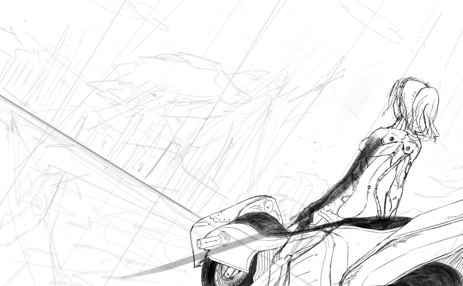
Here is some really quick CG paintings, every painting has been done in less than 1 hour each, but don't think I'm worried about time anymore, we should be worried more about the over all idea instead of little details as I mentioned before, sketches can save our life in hard situations, with sketches we are FORCED to work directly into a message, no licking, we can't get lost in details or secondary matters.

But feel free to ignore all advices said in this blog, you are free to believe anything you want at your own, if something is useful for you take it.

(exploratory sketches!)
Divisory Line
__________________________________________________________________


Some CG face sculpt, no reference and really fun!


I decided to go back, and fill the missing stage, I realized I can't go on and create true CG Feelings
without ever touched traditional art media/Fine art, such as real painting media and drawing media.
I have to say I just LOVED acrylics and oil, CHARCOAL is just so smooth, every stroke is full of vitality and flexibility, I can't believe what have I been missing, and now is a good time to start, and let me tell you is my first time touching any traditional media, so please be kind ^^u.
I need a lot of patience to carry this enthusiastic autodidact course so let's continue and remember.
those who cannot begin do not finish

( I was like, traditional media? who?)

Acrylic colour wheel, here are some tips you could use if you try to attempt mix colours.
Follow that order and is easy to remember each colour, the idea is to have the most intense saturation of those pigments, to dull them after that, because no mixing can give true saturation to any hue
is really important!!!!
And also if you are about to mix, always choose the lighter value hue first as a base for the mixing and ONLY THEN add just  A LITTLE BIT of the darker hue, mixing is like that, darker hue eats lighter hue as a soul eater, the way it works is simple, add tiny bits of darker hue into a base light hue, drop by drop until is nice to use it, if you don't do it this way, the darker colour wheel will delete all other pigment and delete any residual hue and the mixing has failed, and we have to start over and over again :c ( I wanted to avoid this but my bad luck drove me right into this pigment mud problem, I had to mix 5 times yellow and orange in order to get yellow-orange , I was getting pink / ultra saturated orange and ultra saturated pink) so start thinking from light to dark really like CG, only here is more dangerous, so before mix any colour think the order first then do it.

12 essential hues relationed to a clock (really useful!)
Y - 12
Y- O - 1
O - 2
R - O - 3
R - 4
R - V - 5
V - 6
B - V - 7
B - 8
B - G - 9
G - 10
Y - G - 11
I hope I can post some paintings soon, I'm still way too amateur for this ...
( 4 hours to mix this color wheel (above), I can't believe how difficult it turned to be after all, Is intresting the limitations of real media towards what we take from granted in CG, really intresting discovering how bad I am in real media and not what I tought it could be, let's push Harder!!!)


And some crappy 3DCGI Gaming level.
Thank you for reading!
and
Keep ON!

Saturday, August 17, 2013

Illustration Approach

Before even Begin, I will like to tell you this is one personal approach for illustration work, must of my work is Illustration so, I hope it helps to clarify some questions about this topic, I don't like to marry one method or another, and you should not do it, it takes away all the fun factor, I encourage you to try and fail, and you may find more fun and exciting ways wich fill your needs, but let's go to the point.

________________________________Divisory Line_______________________________________

It should start with one idea (as everything else), sketch the over all composition I want a view from a weird angle of a girl looking at a futuristic city, I want to leave at the viewer a lot of assumptions, as what is happening there? so let's continue 

First I like to know the people inside the little story more, before developing a full illustration, this may be not neccesary but I really, don't like to make fanarts, I like to practice on character develop in each work I do, so each character I do is original so;
Here is the design I did for this character.-


Well after knowing the character, and do a little thumbnail of the over all idea, I made the lines of the sketch cleaner but of course, need polish and a lot of corrections but, at this point, I'm still quite doubt about if I should omit things or change another ones, but that is worth of doing it at this stage, this stage is the perfect momment for deciding things, later on, will be really hard for turning back and re do it, of course you can, but why bother? now we are just having fun and trying things out.

Lines polished but still not lineart yet.-

This is a quick painting, to stablish the colour palete, mood and lighting, late evening, really warm is the first thing to come in my mind at this stage, I tried to use some colors which I didn't use at the final composition for contrast sake.


So what's that thing where she is sitting? well is a good idea to have some references to know it's volume and space relative to the over all enironment of the things you might consider important, otherwise, you should make it on the fly, I wanted to try some future motorcycle design, to understand how she uses it or why.-


Well, after stablishing all I tought I needed, I start to polish, as you can see, her cloth design changed at the end, maybe I should left it this way, but I inclined for rejected it, and I covered her back at the end.


Then try some lighting shading, coherent to the kind of mood, weather and environment.-


City shading and over all elements polished up and there we have the final composition.-


Maybe I should think different the next week or tomorrow but, work at your own peace and rythm, and over all, enjoy it.
__________________________________________________________________________

This is some other work I've been doing.-
Some rejected idea (maybe re-picked later...)


And here is a CG Portrait , the model is my amazing friend Grace I'll let her gallery down here you should visit her.-
http://karshaforever.deviantart.com/


No doubt each passing day seems shorter and harder to beat, but it doesn't matter, let's do our best to collect all we can an truly enjoy what we have.

Thanks for reading.
Keep ON!!


Thursday, August 1, 2013

CG drawing

I like to do some fanarts once a while, I like almost every art style out there, but there is always something in particular what catches our attention and make us wonder more about it, is my case with the artist named Tomoyuki Yamasaki, and George Kamitani, those 2 artists are my main influence in anime style, I also like a lot more artist out there but I want to share with you this 2 because they represent some good times in my life, I always liked they work and also somehow try to emulate it, but I 've never been so worried about it, even now, is nice to have some time to finally dig up into this way of drawing and I hope I can learn some stylished things about the way of working this way.
Long time since I don't post anything new but, this is not an excuse, in fact, I've been working, time management is just way to hard for breaking the time periods, and also is kind of funny how the work you made is not yours anymore because you sell all the rights of it and now is property of the company you are working to,be careful in protect that info, information is one of the most valuable things one company can have so, finally I get some breath and I can share some personal work with you.
some anime style work, inspiration from the artists already mentioned

______________Divisory Line______________


and finally drawing friend portrait and CG painter practice.


Keep ON!!

Thursday, June 27, 2013

CG Painter, June 27th 2013

Yes,  After some days looking for information, I'm happy to say, I've found some useful sources which I'll like to share with you at the end of this post.
So after studying a lot about design, and painting, and art and 3d sculpt (brain overheat!)
I've come to some stuck point, some things that, sources as books can't respond, I wish they could but, at the turn of the page, is a new panorama, and it just left a lot of gray behind...
Here is a problem I've found, we have some freedom in order to control the viewer's eye and make some points contrast with the rest of the composition, well that's good news but, We enter into a conflict, how much can we push it?
in example (a) we can see a boring contrast, the viewer eye don't know what is happening there, too few contrast can cause a complete lose of the viewer intrest, but at example (b) there is an exaggeration, do you remember what I told you? We can manipulate this factor but the problem can be bigger than you tought:
What's the correct contrast of the scene? WITHOUT loosing realism and break the illustion of depth?
Here is a very very very important factor of the overall union, depth, maybe we can solve that with perspective or light effect but, falling into realism involves loosing control in contrast.
You can see that in example (c), there is a common color contrast but as you can see, the red part screams for attention and there is not such appealing realism opportunity in there, looks too exagerated, so how can we solve this problem?
Doing realism without caring about contrast?
Doing contrast loosing realism?
Take care of composition and have few contrast and depth?


In the middle of this searching about design and to make it clear, I'm not really familiar with the fundamentals and even theories about design, I'm an intuitive person but never tought about this way of thinking until now, about everything I've read until now, my word for describing design should be "Think"
Even there is a visual language which I'm not familiar with it, and I'll post about it soon, but sounds really interesting and finally got some kind of few questions finally answered. I'll let you an image about this searching and you will find that this is an obvious assumption, but this kind of theory gives us some sort of guide in order to come up with good answers, thinking outside the frame, will make all choices possible, then get unusual results, but as I said in my previous post, how far is it possible to go to don't lose the human eye. "Going far but close enough, and being close and far enough in order to people make sense of what we are doing, without falling in useless and illogic results."
Well, I understimate design a lot, now I'm paying the price.
neccesity is the mother of invention ...


Well More progress is up to come and I'm finally happy to know more aboutthat mysterious design thing which don't let me sleep.
_____________________Divisory Line____________________

As Is tradition, here is some practices I've been doing not too long ago, remember, CG actally is not the main point of this blog, but I hope you can take some useful things from here and avoid hitting the same rock as me in time.


And a little early but here is the before and after review of the progress of my paintings from 2012 until now, this is not a great evaluation, and even accurate, but helps to proof some things. Keep ON!.


More to come, Stay tune! KOD

Colour theory.- Real Color Wheel
                                                     My Livestream.- Livestream Goodendgraphics

Friday, June 21, 2013

SUMMER 2013

Every season of the year is an amazing moment for a retrospection of the progress, I like the way world changes through time and let us a lot of new experiences and lessons from life, we maybe seem strong but, all of us have some past from which we want to get away from as far as we can but, only time can heal the scars, no more speaking and let's back to the post!
This Time I show you the Pixologic Zbrush interface, at this point I was forgeting the way it works so, I want to give it another chance in order to get better at it, I have seen a lot of amazing sculpture artwork and Im eager to do some of those (if I'm able to)
Okay this is an old model of my OC Merit, I know I know, maybe looks crappy , and I apologize for that, but we have to start from something right?
There is a screenshot of my OC in profile and with some confusing Zbrush UI elements which I will break down here:
_____________________________________________________________________________


Don't let this scare you, Developers and software is meant to be easy for use, think of the new software as a tool, not an enemy, programmers will make our job as easy as they can but in order to be, there should be more options for support this, imagine just 2 buttons for "create sculpture" and "magic render" (I wish it could be that way but in real life, and in CG work as well, that is impossible, there is 1 element missing and it is you, your creativity, so there is no other option of taking the hours, the days or even years to digging into something and finally get familiar with it, so this is what I have been learning.-
(I marked the names of the menus down here)


Every menu have a specific function and depending on what you are up to, you will need certain windows and tools, so not all the time you will be using all menu, maybe later I'll do some sculpt videos, but I need to learn more for do that, I'm interested in exporting my sculpt into a 3d program, I'll be using Autodesk Maya and 3ds Max for this, I HAVE NO IDEA yet, about the methodology of this process, but I get some unusual results down here.
proceed in following this steps after completing your sculpt.


Select Maya or your application for GozPath and Bingo, that's all you need to do, don't forget to get some Uvs and maps to get the sculpt with lower geometry (Im still confused about this part)


Here is the sculpture in a 3d application (Yeah!!!!!! now what?) well I tried to render it out and well, it had no material in it like in zbrush, so maybe those materials are just for zbrush previsualization, it exports every map you assing to the model into a blinn material, so it does a good job, anyway, lets keep moving.


And here is the render with some notes. Kind of dissapointed from the Zbrush result but, Do not get me wrong, I'm still an amateur Zbrush user so, I can swear, I missed so many steps, anyway, here is my best result, there is some stuff for improvement like topology, which I need to investigate and poly count, (damn this model was over 1 million of polygons!
But overall, I'm eager to keep reading more tutorials about this amazing software, I mean, I have never used this kind of software, is so intuitive and makes you feel like true sculpture student.

Here is some Merit Illustrations (My OC from above)


I hope I can come with better results next time!
let's keep learning!

______________________________Divisory Line____________________________

The understanding of anatomy should be not a problem at this point (give a look at my firsts blog posts, you will find everything in there) now the challenge is exaggerate or express human anatomy in an aesthetic way, Im kinda bad in that but, let's see what we can do.

KOD.